CSS fundamentals
HTML
OR
< style type="text/css" >body {
font-family: arial;
background-color: rgb(185,179,175);
}
h1 {
color: rgb(255,255,255);
}
</style >
Styles.css
{
Property: Value; /* This is a CSS rule */
}
I. CSS Selectors
1. Basic selectors
HTML
<h4 class="My_class"> Class selector: Targets elements that have the specified class name as part of their class attribute. </h4>
<h4 id="My_ID"> ID selector. Targets the element with the specified ID attribute. </h4>
<h4> * Universal selector. Targets all elements. </h4>
CSS
.My_class{ color:green; }
#My_ID { color: blue; }
*{ color: purple;}
Result
tagname—Type selector or tag selector. This selector matches the tag name of the elements to target.
Class selector. Targets elements that have the specified class name as part of their class attribute.
ID selector: Targets the element with the specified ID attribute.
* Universal selector: Targets all elements.
2. Combinators
-
Child combinator (>):
Targets elements that are a direct descendant of another element. -
Adjacent sibling combinator (+):
Targets elements that immediately follow another. -
General sibling combinator (~):
Targets all sibling elements following a specified element. Note this doesn't target siblings that appear before the indicated element.
HTML
< h4 >Syllabus < /h4 >
< ol >
< li >
< h4 >Chapter 1 < /h4 >
< ol >
< li >Section 1.1 < /li >
< li >Section 1.2 < /li >
< /ol >
< h4 >Lab 1 < /h4 >
< h4 >Test 1 < /h4 >
< /li >
< li >
< h4 >Chapter 2 < /h4 >
< ol >
< li >Section 2.1 < /li >
< li >Section 2.2 < /li >
< /ol >
< h4 >Lab 2 < /h4 >
< h4 >Test 2 < /h4 >
< /li >
< li >
< h4 >Chapter 3 < /h4 >
< ol >
< li >Section 3.1 < /li >
< li >Section 3.2 < /li >
< /ol >
< h4 >Lab 3 < /h4 >
< h4 >Test 3 < /h4 >
< /li >
< li >
< h4 >Chapter 4 < /h4 >
< ol >
< li >Section 4.1 < /li >
< li >Section 4.2 < /li >
< /ol >
< h4 >Lab 4 < /h4 >
< h4 >Test 4 < /h4 >
< /li >
< /ol >
< /div >
CSS
color: #8c1515;
font-size: 20px;
font-weight: bold;
}
.My_Div li {
color: black;
}
ol + h4 {
color: #000000;
font-size: 20px;
font-weight: bold;
}
ol ~ h4 {
text-decoration: underline;
}
Result
Syllabus
-
Chapter 1
- Section 1.1
- Section 1.2
Lab 1
Test 1
-
Chapter 2
- Section 2.1
- Section 2.2
Lab 2
Test 2
-
Chapter 3
- Section 3.1
- Section 3.2
Lab 3
Test 3
-
Chapter 4
- Section 4.1
- Section 4.2
Lab 4
Test 4
3. Pseudo-class selectors
-
:first-child
Targets elements that are the first element within their parent element. -
:last-child
Targets elements that are the last element within their parent element. -
:only-child
Targets elements that are the only element within their parent element (no siblings). -
:nth-child(an+b)
Targets elements based upon their position among their siblings. -
:nth-last-child(an+b)
Similar to :nth-child(), but instead of counting from the first element, it counts from the last element. -
:first-of-type
It considers an element's numerical position only among other children with the same tag name. -
:last-of-type
Targets the last child element of each type. -
:only-of-type
Targets elements that are the only child of their type. -
:nth-of-type(an+b)
Targets elements of their type based on their numerical order and the specified formula. -
:nth-last-of-type(an+b)
Targets elements of their type based on a specified formula, counting from the last of those elements backward. -
:not(selector)
Targets elements that don't match the selector within the parentheses. -
:empty
Targets elements that have no children. Beware that this doesn't target an element that contains whitespace. -
:focus
Targets elements that have received focus, whether from a mouse click, screen tap, or Tab key navigation. -
:hover
Targets elements while the mouse cursor hovers over them. -
:root
Targets the root element of the document. In HTML, this is the < html > element. But CSS can be applied to other XML or XML-like documents, such as SVG; in which case, this selector works more generically.
HTML
< div > < /div >
< div > < /div >
< div > < /div >
< div > < /div >
< div > < /div >
< /div >
CSS
{
background-color: #8c1515;
}
Result
:first-child
:last-child
:nth-child(2n)
:nth-child(n+2)
:nth-child(-n+2)
:nth-last-child(n+2)
:nth-last-child(-n + 2)
:only-child
h3:first-of-type
H1
H1
H3
H3
H3
H5
h3:last-of-type
H1
H1
H3
H3
H3
H5
h5:only-of-type
H1
H1
H3
H3
H3
H5
h1:nth-of-type(2)
H1
H1
H3
H3
H3
H5
h3:nth-last-of-type(2)
H1
H1
H3
H3
H3
H5
:not(h3)
H1
H1
H3
H3
H3
H5
h3:empty
H1
H1
H3
H3
H5
:hover
:focus
4. Pseudo-element selectors
Pseudo-elements are similar to pseudo-classes, but instead of selecting elements with a special state, they
target a certain part of the document that doesn't directly correspond to a particular element in the HTML.
They may target only portions of an element or even inject content into the page where the markup defines
none.
These selectors begin with a double-colon (::), though most browsers also support a single-colon syntax for
backward-compatibility reasons.
HTML
CSS
content: "Before";
color: #8c1515;
}
Result
::before
Nothing was there before.
::after
Nothing was there after.
::first-letter
The first letter was black.
::first-line
All the lines of this paragraph were black. We can change the styling of the first line of a paragraph using the ::first-line pseudo-element.
::selection
If you select a portion of the text, its background will be changed to yellow. Like a highlighter.
III. CSS Typography
1. System fonts
Each operating system has its own set of fonts that come pre-installed.
You may use some fonts that are not available on the user's device.
Subsequently, developers used to writing font stacks, which
enable them to write a font “wish list” for the browser.
The browser reads this declaration and goes from left to right until it finds a font it has available,
choosing that to render the associated text.
Some font names contain whitespace, so it is necessary to surround those strings
with single or double quotes.
HTML
Some content...
</div >
CSS
font-family: -apple-system, BlinkMacSystemFont, Roboto, Ubuntu,
"Segoe UI", "Helvetica Neue", Arial, sans-serif;
}
The terms typeface and font are often conflated. Traditionally, typeface refers to an entire family of fonts (Roboto), usually created by the same designer. Within a typeface there may be multiple variants or weights (light, bold, italic, condensed, and so on). Each of these variants is a font.
2. The @font-face CSS rule
Web fonts use the @font-face at-rule to tell the browser where it can find and download custom fonts for use
on a page;
To make a web font available for use in our CSS, we use the @font-face at-rule. This lets us provide a name
for the font that we can then reference, and also tells the browser where to go to fetch this file from.
HTML
Lorem, ipsum dolor sit amet consectetur adipisicing elit. Pariatur laudantium illo repellat ullam repudiandae quia quos quibusdam molestiae totam, provident id nisi tenetur! In aliquam, reiciendis iste amet minus maiores.
</p>
<p class="My_Font_2"> Lorem, ipsum dolor sit amet consectetur adipisicing elit. Pariatur laudantium illo repellat ullam repudiandae quia quos quibusdam molestiae totam, provident id nisi tenetur! In aliquam, reiciendis iste amet minus maiores. </p>
<p class="My_Font_3">
Lorem, ipsum dolor sit amet consectetur adipisicing elit. Pariatur laudantium illo repellat ullam repudiandae quia quos quibusdam molestiae totam, provident id nisi tenetur! In aliquam, reiciendis iste amet minus maiores.
</p>
<p class="My_Font_4">
Lorem, ipsum dolor sit amet consectetur adipisicing elit. Pariatur laudantium illo repellat ullam repudiandae quia quos quibusdam molestiae totam, provident id nisi tenetur! In aliquam, reiciendis iste amet minus maiores.
</p>
CSS
font-family: "My_Font_1";
src: url("../Fonts/My_Font.woff2") format("woff2"),
url("../Fonts/My_Font.woff") format("woff");
font-weight: normal;
font-style: normal;
font-display: fallback;
}
.My_Font_1 {
font-family: "My_Font_1", sans-serif;
}
@font-face {
font-family: "My_Font_2";
src: url("../Fonts/My_Font.woff2") format("woff2"),
url("../Fonts/My_Font.woff") format("woff");
font-weight: normal;
font-style: normal;
font-display: fallback;
}
.My_Font_2 {
font-family: "My_Font_2", sans-serif;
}
@font-face {
font-family: "My_Font_3";
src: url("../Fonts/My_Font.woff2") format("woff2"),
url("../Fonts/My_Font.woff") format("woff");
font-weight: normal;
font-style: normal;
font-display: fallback;
}
.My_Font_3 {
font-family: "My_Font_3", sans-serif;
}
@font-face {
font-family: "My_Font_4";
src: url("../Fonts/My_Font.woff2") format("woff2"),
url("../Fonts/My_Font.woff") format("woff");
font-weight: normal;
font-style: normal;
font-display: fallback;
}
.My_Font_4 {
font-family: "My_Font_2", sans-serif;
}
Result
Lorem, ipsum dolor sit amet consectetur adipisicing elit. Pariatur laudantium illo repellat ullam repudiandae quia quos quibusdam molestiae totam, provident id nisi tenetur! In aliquam, reiciendis iste amet minus maiores.
Lorem, ipsum dolor sit amet consectetur adipisicing elit. Pariatur laudantium illo repellat ullam repudiandae quia quos quibusdam molestiae totam, provident id nisi tenetur! In aliquam, reiciendis iste amet minus maiores.
Lorem, ipsum dolor sit amet consectetur adipisicing elit. Pariatur laudantium illo repellat ullam repudiandae quia quos quibusdam molestiae totam, provident id nisi tenetur! In aliquam, reiciendis iste amet minus maiores.
Lorem, ipsum dolor sit amet consectetur adipisicing elit. Pariatur laudantium illo repellat ullam repudiandae quia quos quibusdam molestiae totam, provident id nisi tenetur! In aliquam, reiciendis iste amet minus maiores.
3. Optimizing font loading with font-display
FOUT and FOIT
There's usually a moment when the content and layout of the page are ready to render, but the fonts are
still downloading.
It's important to consider what'll happen for that brief moment.
Originally, most browser vendors decided to render the page as soon as possible, using available system
fonts.
Then, a moment later, the web font would finish loading, and the page would re-render with the web fonts.
This is known as FOUT, or Flash of Unstyled Text.
However, most browser vendors changed the behavior of their browsers.
Instead of rendering the fallback font, they rendered everything on the page except the text.
More precisely, they rendered the text as invisible, so it still takes up space on the page.
This is known as FOIT, for Flash of Invisible Text
A new CSS property, font-display, is in the works to provide better control over font loading.
This property goes inside a @font-face rule. It specifies how the browser should treat web font loading.
The possible values are:
- auto: The default behavior (a FOIT in most browsers).
- swap: Displays the fallback font, then swaps in the web font when it's ready (a FOUT).
- fallback: A compromise between auto and swap. For a brief time (100 ms), the text will be invisible. If the web font isn't available at this point, the fallback font is displayed. Then, once the web font is loaded, it'll be displayed.
- block: Get a white screen for up to 3 seconds and then the actual font can replace any system displayed font at any future point.
- optional: Similar to fallback, but allows the browser to decide whether to display the web font based on the connection speed.
HTML
Lorem ipsum dolor sit amet consectetur, adipisicing elit. Quasi nostrum commodi, possimus vitae rerum voluptate, facilis explicabo assumenda veritatis inventore eaque ipsa, sed libero ipsam non voluptatibus facere id dolorum.
< /p >
CSS
font-size: 20px;
font-weight: bold;
font-style: italic; /*normal, oblique */
line-height: 1.4;
letter-spacing: 0.01em;
text-transform: uppercase;/* lowercase */
}
Result
Lorem ipsum dolor sit amet consectetur, adipisicing elit. Quasi nostrum commodi, possimus vitae rerum voluptate, facilis explicabo assumenda veritatis inventore eaque ipsa, sed libero ipsam non voluptatibus facere id dolorum.
IV. CSS Colors
1. RGB color
RGB (Red, Green, and Blue).
A color might be defined in CSS as a hex (hexadecimal) value, where The first two digits are the red value
in hexadecimal, the next two are the green, and the last two are the blue.
Or RGB functional notation, where each value can be specified in a range from 0 to 255.
HTML
< h1 class="My_Other_RGB_Class" > My_Other_RGB_Class </h1 >
CSS
color: #8c1515;
}
.My_Other_RGB_Class {
color: rgb(254, 2, 8);
}
Result
My_RGB_Class
My_Other_RGB_Class
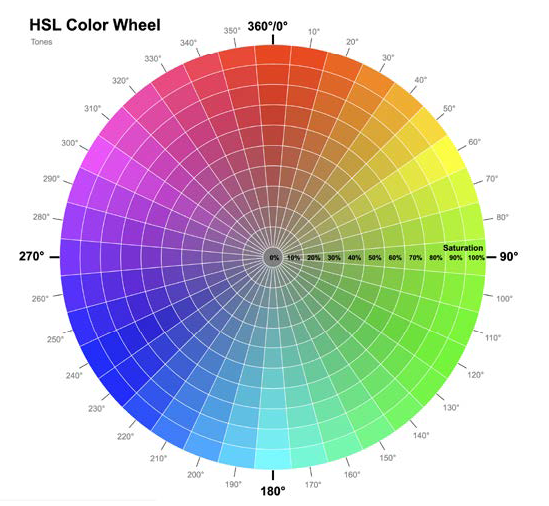
2. HSL color
hsl(hue, saturation, lightness)
Hue is a degree on the color wheel from 0 to 360. 0 is red, 120 is green, and 240 is blue.
Saturation is a percentage value. 0% means a shade of gray, and 100% is the full color.
Lightness is also a percentage. 0% is black, 50% is neither light or dark, 100% is white
HTML
< h1 class="Darker_Blue" > This is Darker Blue </h1 >
CSS
color: hsl(240, 99%, 50%);
}
.Darker_Blue {
color: hsl(240, 99%, 30%);
}
Result
This is blue
This is Darker Blue
3. Alpha channels
Colors can be partially transparent to allow some of what's beneath to show through. For that need, with
hex, RGB, and HSL, it is possible to define an alpha channel.
With hex, you can define an alpha channel with a four-digit or eight-digit syntax.
It used to be necessary to define RGB or HSL colors with an alpha channel using the functional rgba() or
hsla() formats. However, that's no longer needed unless you need to support a very old browser.
HTML
< div class="Alpha_HEX_8" > < /div >
< div class="Alpha_HSL" > < /div >
< div class="Alpha_HSL_Percent" > < /div >
< div class="Alpha_RGB" > < /div >
< div class="Alpha_RGB_Space_Separated" > < /div >
CSS
background-color: #0007;
}
.Alpha_HEX_8 {
background-color: #00000077;
}
.Alpha_HSL {
background-color: hsl(359, 99%, 50%, 0.5);
}
.Alpha_HSL_Percent {
background-color: hsl(359, 99%, 50%, 50%);
}
.Alpha_RGB {
background-color: rgb(0, 0, 0, 0.5);
}
.Alpha_RGB_Space_Separated {
background-color: rgb(0 0 0 / 0.5);
}
Result
4. Display-P3
P3 is a superset of sRGB and makes up to 50% more colors possible.
It uses the color() function to pass the red, green, and blue values.
It differs only in that rather than using 0-255 to set each color channel,
it uses a decimal between 0 and 1, where 0 is none of that channel and 1 is all of it.
HTML
CSS
background-color: color(display-p3 0 1 0);
}
Result
4. LCH function
Lab/LCH are designed to be able to express all of human vision, even if currently our monitors are not
capable of it.
LCH is an abbreviation of Lightness, Chroma, Hue.
The syntax is Lightness as a percentage, then two numerical values: one for the Chroma,
and the third value for the Hue angle.
Like the other functional color notations, you can add a forward slash (/) and then
add an alpha channel as a value between 0 and 1 or a percentage.
Practically, when working with LCH, lower the lightness value for a darker variant of a color,
and increase it for a lighter one.
HTML
CSS
background-color: lch(50% 132 43);
}
Result
II. CSS Units
1. Absolute units
CSS supports several absolute length units: pixel (px), mm (millimeter), cm (centimeter), in. (inch), pt (point—typographic term for 1/72nd of an inch), and pc (pica—typographic term for 12 points).
2. Relative units
2.1 Ems
In CSS, 1 em means the font size of the current element; its exact value varies depending on the element
you're applying it to.
Values declared using relative units are evaluated by the browser to an absolute value, called the computed
value.
Using ems can be convenient when setting properties like padding, height, width, or border-radius because
these will scale evenly with the element if it inherits different font sizes,
HTML
This text is 20px large and the padding is 1em
< /div >
< div class="EMS Large_EMS" >
This text is 40px large and the padding is 1em
< /div >
CSS
border: solid 3px #8c1515;
padding: 1em;
}
.Large_EMS {
font-size: 40px;
}
.Small_EMS {
font-size: 20px;
}
Result
If we em unit to specify font-size itself, the ems will be derived from the inherited font size.
It's helpful to know that, for most browsers, the default font size is 16 px. Technically, it's the keyword
value medium that calculates to 16 px.
What makes ems tricky is when you use them for both font size and any other properties on the same element.
When you do this, the browser must calculate the font size first, and then it uses that value to calculate
the other values.
2.2 Rems
When the browser parses an HTML document, it creates a representation in memory of all the elements on the
page. This representation is called the DOM (Document Object Model). It's a tree structure, where each
element is represented by a node. The < html > element is the top-level (or
root) node. Beneath it are its child nodes, < head > and
< body >. And beneath those are their children, then their children, and so on. The root node
is the ancestor of all other elements in the document. It has a special pseudo-class selector (:root) that
you can use to target it.
Rem is short for root em. Instead of being relative to the current element, rems are relative to the root
element. No matter where you apply it in the document, 1.2 rem has the same computed value: 1.2 times the
font size of the root element.
HTML
This text is 20px large and the padding is 1rem
< /div >
< div class="REMS Large_REMS" >
This text is 40px large and the padding is 1rem
< /div >
CSS
border: solid 3px #8c1515;
padding: 1rem;
}
.Large_REMS {
font-size: 40px;
}
.Small_REMS {
font-size: 20px;
}
Result
2.3 Viewport-relative
viewport: The framed area in the browser window where the web page is visible. This excludes the browser's
address bar, toolbars, and status bar, if present.
- vh: 1/100th of the viewport height.
- vw: 1/100th of the viewport width.
- vmin: 1/100th of the smaller dimension, height or width.
- vmax: 1/100th of the larger dimension, height or width.
This is helpful for ensuring that an element will fit on the screen regardless of its orientation: If the screen is landscape, it will be based on the height; if portrait, it's based on the width.